
Don't be afraid of dark walls: how colors work in a room
In short
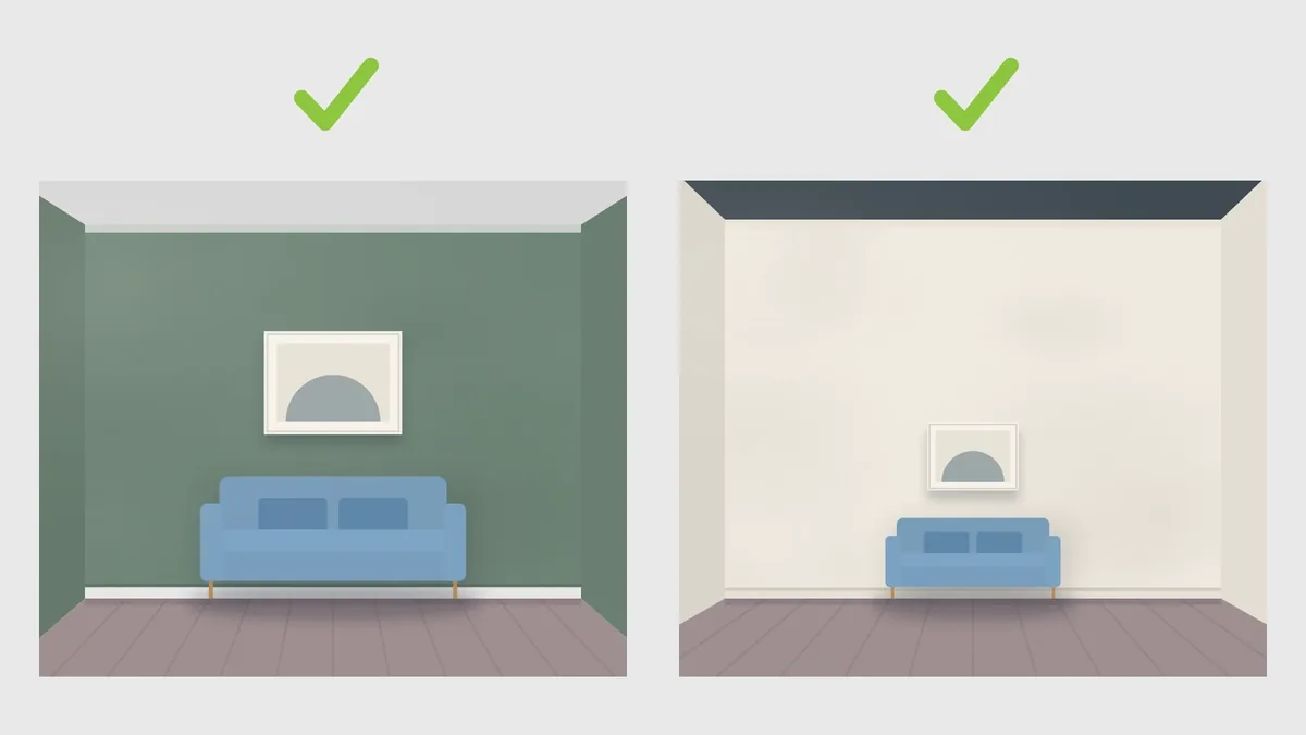
Dark wall colors don't make a room small as long as the ceiling stays lighter than the walls. Dark shades belong on the wall opposite the window, where daylight hits them, not on the window wall itself. If a whole wall feels like too much, use stripes: horizontal for more width, vertical for more height.
Hand on heart: standing in front of the paint charts at the hardware store, wondering whether that dark forest green will turn your living room into a cave – almost everyone knows the feeling. In the end, you play it safe and reach for pure white again. Not because you love white so much, but because nobody wants to spend next weekend painting over it three times in frustration.
Yet interior design isn't about avoiding dark shades at all. It simply comes down to where light and dark go.
The ceiling effect: why looking up makes the difference
If the ceiling stays clearly lighter than the walls, the room visually opens upwards. Behind it is a simple trick: our eye instinctively takes its cue from nature. Darker ground below, bright sky above.
The walls step back, and even compact rooms feel surprisingly airy. At the same time, richer wall colors really bring out your existing furniture – light wooden pieces, sofa fabrics or picture frames practically pop against a darker wall. How high to hang the pictures is covered in How to hang pictures.
Turn it around and paint the ceiling dark, and something interesting happens: the room draws in. In an old building with ceilings almost four meters high, that's fantastic – it takes away the coldness and instantly feels sheltered. Under a standard ceiling height of 2.50 meters, though, you quickly feel hemmed in.
Where should the dark color go? Always where the light falls
A typical pitfall: painting the wall around the window dark. Because you're looking straight into the light, even the loveliest sage green or petrol blue looks like a gloomy shadow.
Put dark colors on the wall opposite the window instead. Daylight hits it full on and makes the shade glow during the day. Light shades belong on the surfaces in between – they bounce the light like a mirror into the corners of the room.
The stripe trick: straightening out proportions
If a whole dark wall feels too heavy, stripes are the best tool for tricking the eye. The eye follows lines automatically:
- For more width (horizontal): A broad, dark horizontal stripe visually stretches a short wall. It works brilliantly in narrow hallways or small rooms that often feel like a tunnel. The stripe breaks up the narrowness and gives the room a horizontal axis.
- For more height (vertical): Struggling with a low standard ceiling? One or two well-placed vertical dark stripes draw the eye upwards and stretch the wall like a visual column.
See it first, then paint
In the end, what matters is never a single shade on a paper strip, but how the colors work together with your daylight, your flooring and your furniture.
That's why, as a Designcoach, I don't rely on gut feeling in an interior consultation. We often test combinations like these straight away in a realistic 3D model. You see at a glance whether the dark shade works better on the wall facing the window or behind the sofa – with no risk, before the first brushstroke.
If you're about to choose colors and would like a fresh, professional view from outside, have a look at my IN TOUCH design workshop. We sit down together in a relaxed setting and find out which colors really suit your home.